Re-imagining Terms & Conditions: Can we make them (more) legible and transparent through visuals?
Can we do for Terms & Conditions / Privacy Policies what Creative Commons did for IP by building a visual iconography?

TLDR:
T&C / PP suck and are a pivotal moment in skewing the relationship between digital providers and users. How might we re-imagine these documents to be legible, accessible, and transparent? Can a visual iconography help communicate what you’re consenting to?
Terms & Conditions are messed up
We think it’s time to shake things up when it comes to Terms & Conditions, aka this one mouse click that legally binds you to an illegible contract with ambiguous contents. We’ve grown blind to telling the lie “I’ve read and agree to the T&C”. As a user, do you have any idea what the fine print reads? Would you think twice if you did?
Agreeing to the T&C of digital products & services is a pivotal moment in the relationship between the user and the organization providing said products & services. T&C are lengthy and illegible. Users give consent to an unread document, handing over control without knowing exactly what they just agreed to, and distorting the power balance.
We don’t have to tell you what’s wrong with Terms & Conditions. There are plenty analysis and lengthy op-eds by people much smarter than us. Instead, we want to probe at solutions and invite you to join us in imagining alternatives.

Inspired by Creative Commons
You are probably familiar with the groundbreaking solution of Creative Commons. This American non-profit organization set out to alleviate the pains associated with copyrights for anyone sharing creativity or knowledge online. They translated the complex legalities of intellectual property and copyright into a visual taxonomy with licenses that are understandable and free to use for the general public.
There are more instances where communicating complex information is of the essence such as traffic signs or the hazard symbols on household products and designers turn to visual taxonomies to do so.
Reframe
Can we do for data rights what Creative Commons did for IP by building a visual iconography for Privacy Policies and Terms & Conditions?
Imagining alternatives
Because they’re legal documents, T&C documents conveniently adhere to a similar structure and terminology. Using a Machine Learning capability called entity recognition, we can automatically extract variations in the content.
Using this, you can be presented with a visual summary of the T&C whenever you’re downloading a new app, subscribing to a new service, or visiting a new website. While surpassing some of the complexity of these agreements, the overview would help you make a more informed and conscious decision, or inspire you to inform yourself some more.
Prototyping an artefact
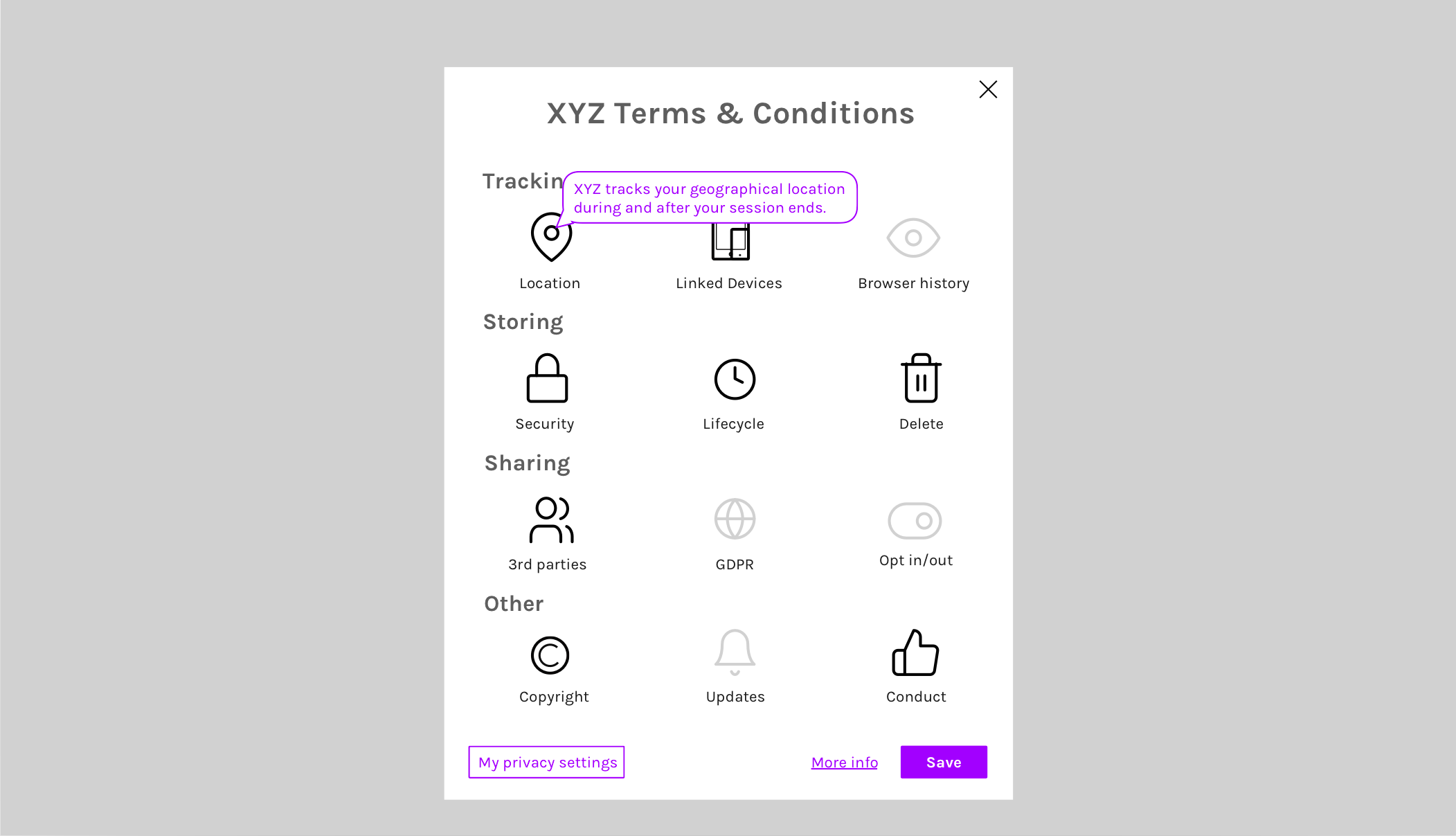
For this prototype, we’ve focused more on the Privacy Policy aspect. Prototyping our way to alternative realities, we imagine something like this:


In these example, the overview is broken into 4 categories — Tracking, Storing, Sharing, and Other — and includes the following elements:
- Location — when it is tracking your geographical location
- Linking devices — does it link your user data across multiple devices
- History — how much of your past behavior does it consider
- Security — estimation of how safely your data is stored and shared
- Lifecycle — how long is your data saved for
- Delete — are you able to delete your content and/or account
- 3rd parties — how many 3rd parties is your data shared with
- GDPR — are these agreements GDPR-compliant and protected
- Opt in/out — are you able to opt-in and -out to parts of the T&C modularly
- Copyright — is the organization allowed to use your content
- Updates — are you notified when T&C change
- Conduct — are you protected on the platform from harmful conduct
We choose these because they’re what we would like to know before we consent, and we’re aware this is a limited interpretation and Terms & Conditions and Privacy Policy documents contain a lot more elements and legal complexities than displayed above.
The notification bubbles of each icon indicate the specifics of the terms. The icons display more information when you hover over them, and link to the corresponding part in the full legal document on a mouse-click.
Based on the information presented to them, the user could move on to agree to the terms, request more information, and ultimately, change their preferences.
Personalization
Ideally, users could design their own “filter” to overlay with this so that they would automatically be aware when a T&C doesn’t match their filter. Instead of giving a general summary of the T&C, it would highlights what appears as sensitive, undesirable, or alarming based on the user’s specific concerns. For example, it might be more or less important to you to be able to delete your profile, whether location is tracked, or whether copyright is protected if you’re publishing creative work.
Collaborations much invited
This article isn’t a pitch for this one idea, but rather an open call for others to begin imagining alternatives. Please add your insights to our prototype of a visual taxonomy, or create your own alternatives. We would love to hear from and co-create with UX designers, lawyers, and anyone in between!
De/scrying
De/scrying is an initiative by Nadia Piet and Mathilde Zamour to collaboratively explore the impact of algorithmic governance, capture the qualia of living in the digital era, and probe at potential and preferable futures through speculative design and public documentation.
